It’s launch day! 🚀 We’ve got a shiny new template for you called Explore. Explore is a beautifully-crafted blank canvas for photographers and designers alike.
Check out a live demo of Explore here and read on to learn more.
Tweak the knobs and make it yours
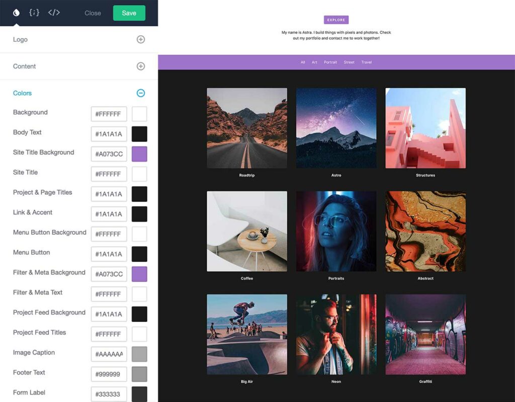
Explore, like all of your templates on Dunked, has a boat load of customization options to help you easily customize it to match your style and brand.
Use the customization screen to add your own logo, change nearly 20 template colors, customize your typography, and add your own CSS styling (if you’re into that kind of thing).

We’ve also added some killer template options that you can toggle on and off to take your portfolio to the next level.
- 2 and 3 Column Project Layouts
- Portfolio Project Filter
- Social Media Icon Links
- Grayscale Image Hover Effect
- Blurred Background Images
- Image Gallery Lightbox
Designed for your content
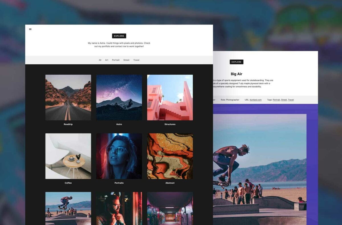
Explore lets you display your portfolio projects in a neat two or three column layout. Use the two column layout for a powerful, punchy display of your photography. Use the three column layout to display more of your design work at a glance.
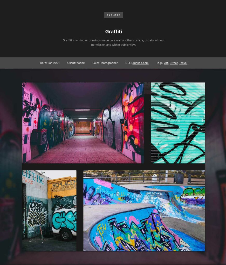
Explore’s portfolio project view is designed to showcase images, image galleries, and even video content.

Images display at full width in the content area, giving you plenty of room to show off attention to detail in your design work, or creamy bokeh textures in your photography.
Image galleries use a Flickr-style layout that keeps your images in a nice and tidy grid. Use the built-in lightbox feature to see your gallery images in a full-screen view.
Try Explore for free today
Yeah, seriously. You can fire up a Dunked portfolio free of charge for 10 days. Sign up, kick the tires, check out Explore and the other templates, and load up a few of your projects to see how nice they look.
Coming up next on Dunked
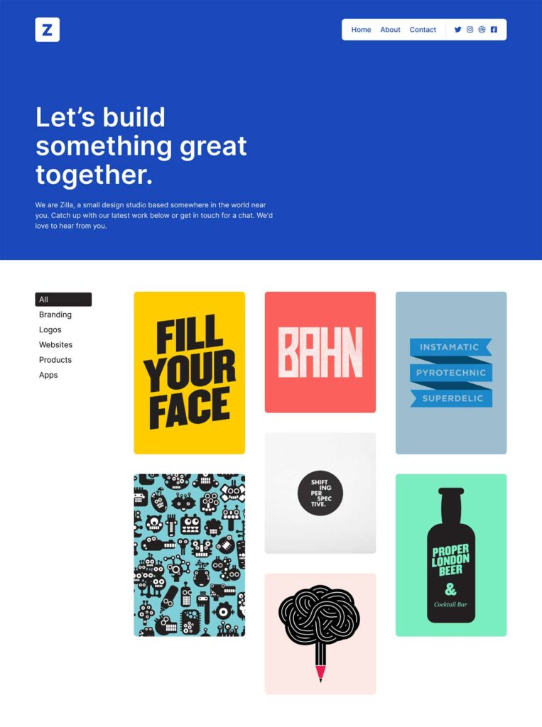
Our next template, Zilla, is already in the works and will be available to power your portfolio shortly. Take a quick peek at the first pixels below!


